SAINT JAMES - PACKAGING DESIGN
/PACKAGING DESIGN
SAINT JAMES agricole rums, famous all over the world for their exceptional quality, are the fruit of a long history of passion, know-how and expertise which started in 1765.
Elaborated from fresh pure sugarcane juice, SAINT JAMES rums have been accredited the Martinique A.O.C. ( Appellation d’Origine Contrôlée/Controlled Designation of Origin) which ensures their quality and their intimate link with the planting terroir.
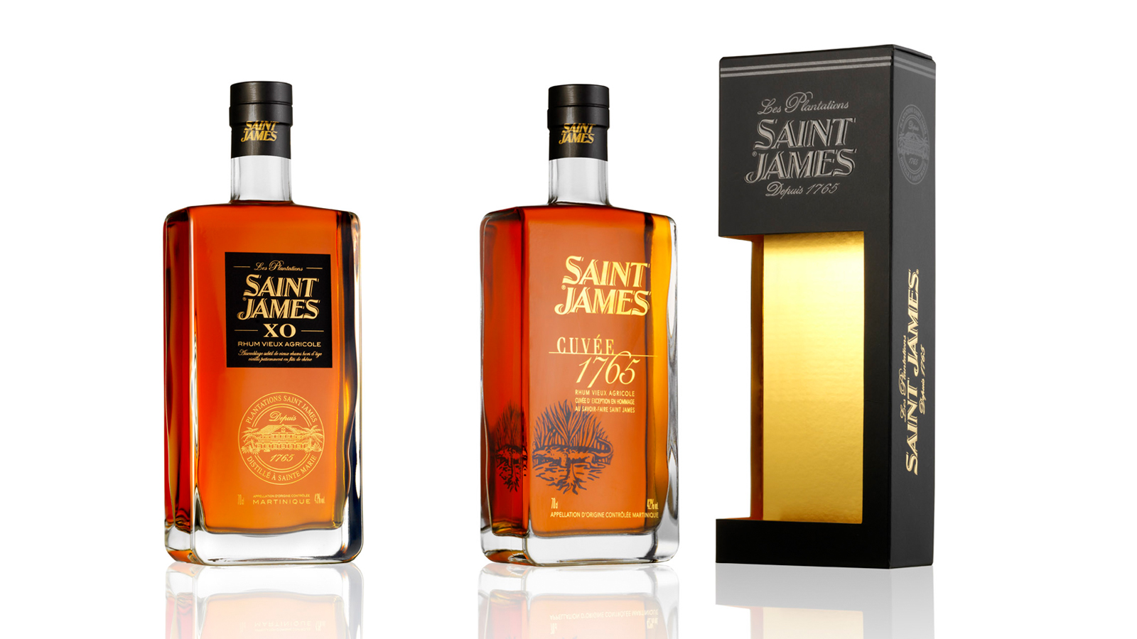
Our mission was to create a packaging common to the three different SAINT JAMES references. The packaging size was adapted to the Long Island 70 cl. This packaging had to value the SAINT JAMES brand and to drive purchase intent across the various distribution networks: GMS, Wine merchants, Export (Duty-free).
We created a sober packaging following the codes of the luxury sector, with a window in the box which lets the front label of the brand readable. The graphics are consistent with the packaging of the 3 decanters so as to create a range effect. The window was designed shifted and overflowing on the side of the packaging to give an identity to the packaging and emphasize the shape of the bottle.
A "Neutral" marking in a way that it is adaptable on the 3 references. - printing on matt black paper: embossing, hot gilt, selective varnish. The inner packaging was lined with gold to sublimate the color of rum drinks.
Assignments : Graphic & packaging design Manufacturing follow-up


