
SHISEIDO BOX SET - FUTURE SOLUTION LX LIMITED EDITION

PACKAGING DESIGN
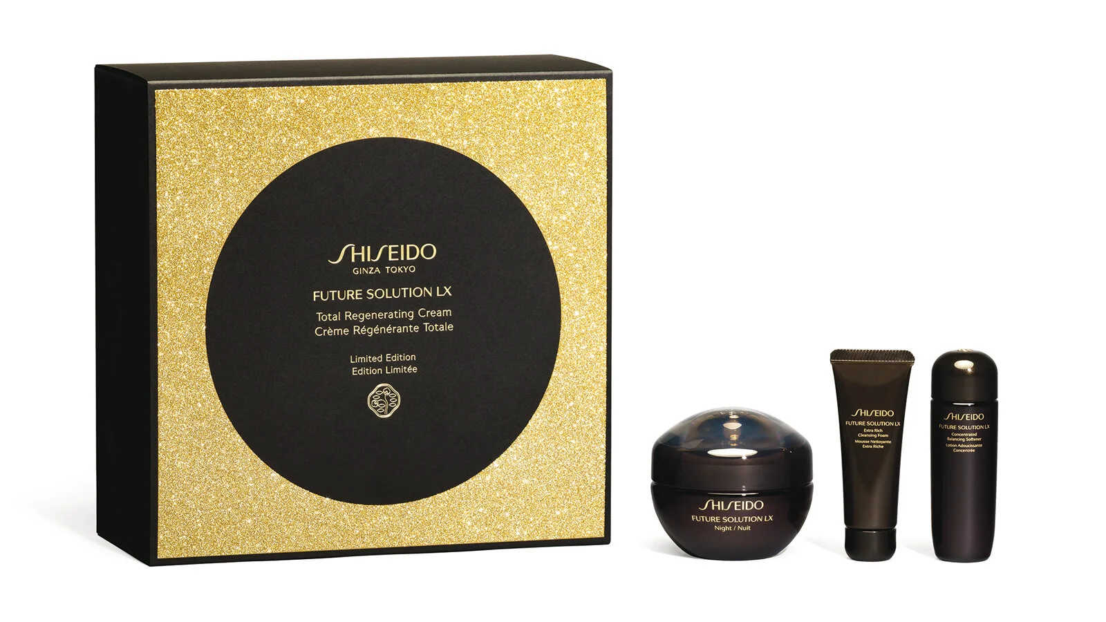
SHISEIDO BOX SET- FUTURE SOLUTION LX LIMITED EDITION
Creation of a reusable premium box to celebrate the 10th anniversary of the Future Solution range from the brand SHISEIDO.
The box contains 3 creations inspired by the culture and botanical myths of Japan, designed to restore the skin's original radiance during the night.
The packaging must convey the premium positioning of the range and its strong connection to its Japanese origin. Our agency chose to dress it with a full moon in negative on the sheath and in positive on the box, adding a touch of glittery gold with hot stamping. The deep matte black contrast and the glittery effect - both visually and to the touch - complete the sensory experience of the skincare ritual from the first contact.
This box was designed in accordance with the delicate art of Japanese packaging, Tsutsumu, using noble materials and a luxurious festive touch evoking the 10th anniversary of the range.
Assignment :
Packaging design
SHISEIDO - CHRISTMAS BOX


PACKAGING DESIGN
SHISEIDO FUTURE SOLUTION LX BOX
Development of a prestige year-end box, aimed at women who desire a comprehensive line of anti-aging skincare creams using the latest technologies.
Design of the box based on the theme of origami, aligning with the brand's premium positioning. A design true to SHISEIDO's identity, combining discovery, folding, and strongly embodying contemporary Japan.
The camellia, the brand's symbol, closes the box. The box is dressed in textured black paper with a gold interior.
Assignment:
Packaging design
ECRIN DE FLEUR - GLOBAL DESIGN


GLOBAL DESIGN
Design for a brand of natural soaps made in France and aimed at Chinese consumers. Écrin de Fleur soaps are made with natural, eco-friendly ingredients, offering various skin benefits.
We created the brand name, identity, and graphic universe, as well as the packaging design. We developed a strong, spiritual symbol to represent the brand: the Flower of Life, which is universally recognized and found in many Chinese temples. This flower emits a harmonious, beneficial wave and forms a symbolic rosette of nature's elements.
Reflecting the natural spirit of Écrin de Fleur, this identity highlights a connection between the well-being of body and mind and showcases the soaps' properties: they regenerate, rebalance, harmonize, energize, and protect against external aggressions.
The packaging reinforces the brand’s spirit and has a dual meaning:
- A clean look, echoing the quality and purity of the ingredients, representing the spiritual values of Écrin de Fleur.
- The emphasis on nature, with an illustrative herbalist style linked to the scent of each soap. (Working on a color palette consistent with the different scents).
The brand name was chosen to reflect the intrinsic qualities of the products. The Flower of Life is emblematic and inseparable from the brand's visual identity, and the 'ecrin' (jewel case) highlights the precious qualities of its products: a care ritual that offers numerous benefits for body and mind.
Assignments:
Brand Strategy
Brand name
Brand Identity
Packaging design
Graphic charter
CARITA IDEAL AND PURE SELECTION


OPERATIONAL COMMUNICATIONS & PACKAGING DESIGN
Iconographic design choices to show off CARITA's premium and sensory positioning and to support the strategic launches of its flagship product lines.
Assignments :
Shape design
Communication strategy
Artistic direction & iconography
Publishing and POS materials
EUGENE PERMA - CARMEN


GLOBAL DESIGN
We came up with a unifying concept centered around the bayadère for the launch of the new professional coloring range, CARMEN, and applied it across various platforms.
Assignments:
Color chart
Volume design
Merchandising design
Artistic direction & Iconography
Promotional video
EUGENE PERMA - CARMEN

GLOBAL DESIGN
A unifying concept around the bayadère for the launch of the new professional coloring range CARMEN and its adaptation across multiple platforms.
Assignments:
Color chart
Volume creation
Merchandising design
Artistic direction & Iconography
Promotional video