DISTILLERIE CASTAN - GLOBAL DESIGN


GLOBAL DESIGN

Artisan distiller for three generations in Occitanie. A craftsmanship passed down from father to son.

The story of Castan Distillery is intertwined with the Castan family. It all began with Grandfather Gilbert, followed by the father, and today the son continues the tradition. At the heart of this story lies an old red copper still dating back to 1929, which Grandfather Gilbert took along on his travels throughout the Tarn region, producing smooth and refined spirits.

Crafted by Sébastian Castan, Vilanova is a French whisky from the third generation of an artisanal distillery. The distillery's trademark is producing only single cask whiskies with distinctive features. A product of craftsmanship, Vilanova is an excellent French whisky.

We were missioned to defining the identity of the Castan Distillery brand, as well as its Vilanova whisky range.

Castan distillery brand identity:

We designed an emblem that reflects the shape of the Occitanie Region Coat of Arms. This emblem gathers all facets of the house activities. Here they are:

Barley cultivation: Farm and distillery are endorsing barley cultivation. It is cultivated by the Castan family on their owned land.

Water sourcing: The distillery draws its water from a depth of 110 meters, sourced from a natural spring that gives Vilanova whisky its distinctive character and taste.

Aging: The Vilanova range offers different types of aging: in old white wine French oak barrel, as well as in old red wine French oak barrels.

Packaging Identity of the Vilanova Whisky Range:

To emphasize the distinctive features of this range, we chose black and white photographs that tell the brand's story, combined with colorful and modern elements representing the new generation.

Berbie: The first Single Malt distilled by Castan distillery. (photo of barley cultivated by the family)

Gost: A unique edition aged in old Bourbon barrels. (photo of the barrels)

Roja: The heart of this story lies in an old red copper still. (photo of the still)

Terrocita: Rooted to the region's land. (photo of the region)

Argile: Evoking the clay soil of Occitanie and the use of spring water. (photo of the spring)

Gilbert: Collection #1 is the result of a blend of historical barrels, carefully selected from the finest signatures, aged in the distillery's cellars. A tribute to the founder of the distillery, Gilbert Castan.

Assignments :
Brand Identity
Packaging design

KARUKERA - PACKAGING DESIGN


PACKAGING DESIGN

PACKAGING DESIGN

Karukera launches a new range of punches with Guadeloupean agricultural rum.

Passed down from generation to generation, the recipes of Karukera house combine freshly cut tropical fruits, vanilla, and Guadeloupean agricultural rum.

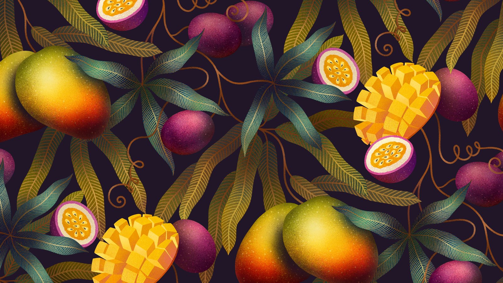
Three flavors: Passion fruit, Mango/Passion, and Pineapple Victoria.

A design we wanted to illuminate with sunshine and good vibes, custom-made illustrations with a true distinction on it, full of colors and modernity.

An ode to celebration and sharing that brings a breeze of freshness to the world of ready-to-drink punches.

A punch that will stand out on every table, at every parties.

Assignments :
Packaging Design  

COMTESSE DU BARRY - CHRISTMAS 2020


DESIGN PACKAGING

A gourmet tour in an enchanted forest.

As every year, we have been charged with the entire creation of the Christmas range of La Comtesse Du Barry.

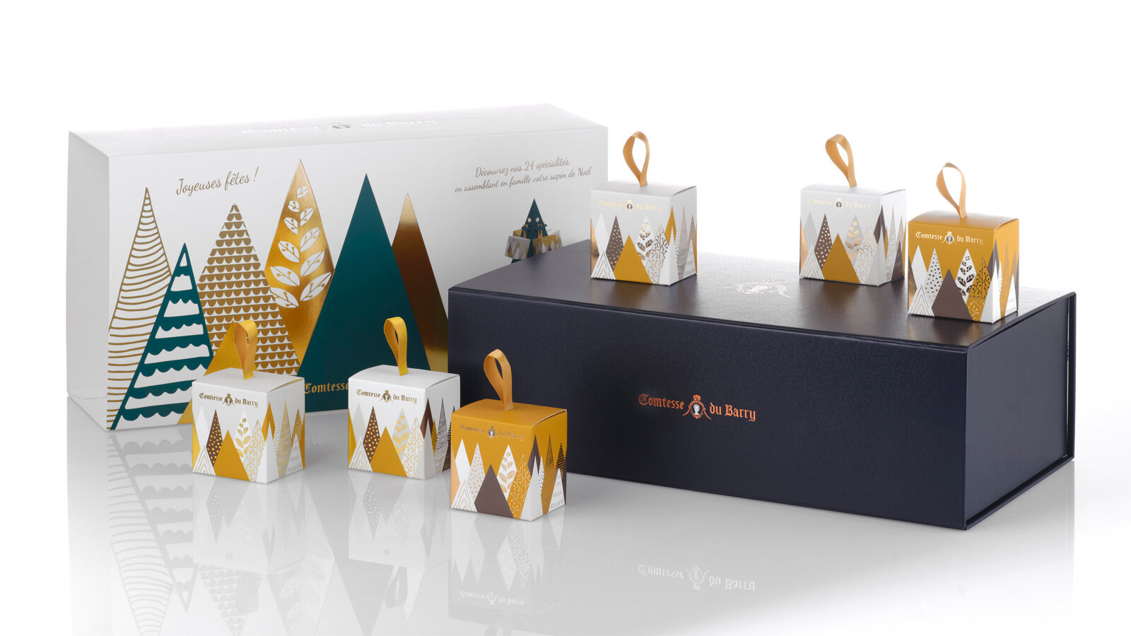
Pour 2020, we designed a magical world in which good food and creativity combine to express the best of French produce in its compositions.

An enchanting range of forest-themed gifts that carry the eater off on a festive journey. It is an invitation to escape to the enchanted forest. 

Unusual advent calendars, enchanting receptacles, refined specialties from the land and the sea... each product undergoes stringent selection and is painstakingly worked in an ode to Epicureanism that varies pleasures and delights the palate. 

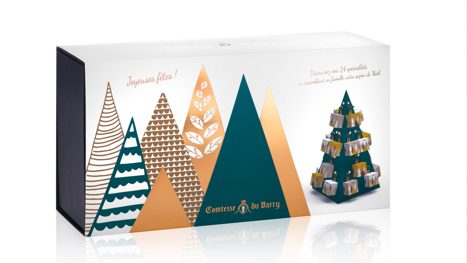
Sweet calendar: every tree hides a gourmet chocolate to make the wait up to Christmas as delicious as possible. The calendar stands as a decoration, and a new tree emerges every day to create an enchanted forest. 

Savory calendar: Advent calendars are traditionally thought of as something you open every morning. But why not, in a slight twist, leave the surprise for the evening hour?

This Advent calendar takes the form of a 48 cm high cardboard Christmas tree to assemble. It will blend perfectly with your Christmas decorations. 24days of waiting, with 24 little packages to open and discover the best specialties from France.

Foie gras, porcini mushrooms and truffles gift box: a numbered limited edition containing the sweetness of foie gras, the delicate aroma of porcini mushrooms and the power of truffles in a pyramid-shaped box with a contemporary iridescent forest decoration. 

Assignments:
Packaging design

MAISON BLIN ARTISAN PASTA


GLOBAL DESIGN

Sébastien Blin asked the agency to develop a packaging concept that stands out from current trends by highlighting the traditional and innovative aspects of his products. He has just created his brand of flavoured pasta made in Beauce, France. His ambition is to sell his products through all the premium grocery stores in Paris, in a spirit of short local marketing circuits, since his farm is located a mere 50 km from the capital.

Brand name creation. We have opted for an authentic name, both traditional and modern, which uses the client’s last name. The addition of the word “Maison” reflects know-how and reliability, and does not limit the range to pasta.

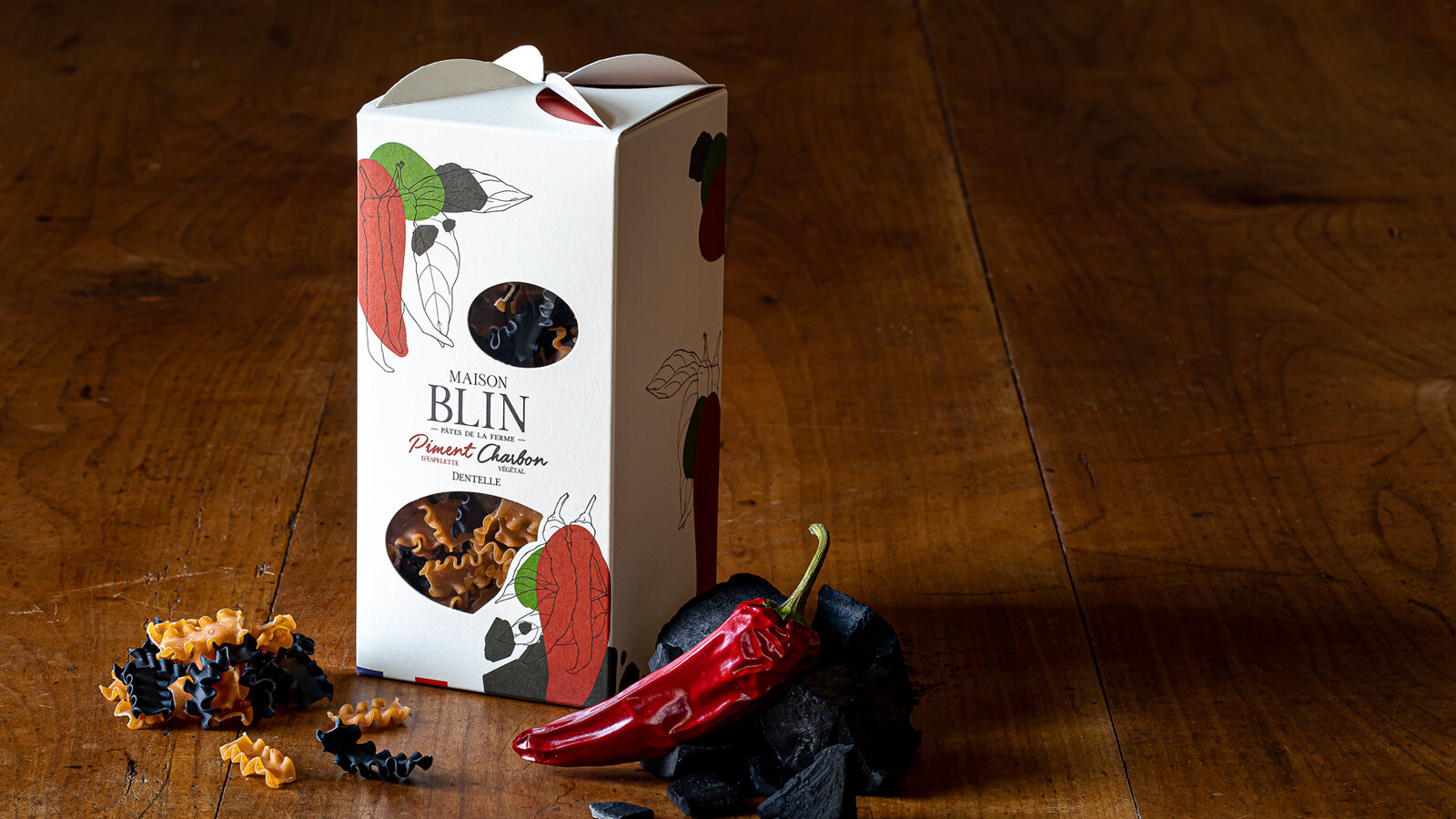
While creating the packaging, we were looking for something simple, elegant and easy to identify, which stands well apart from the competition with a signed folded part on the top of the package that evokes windmill sails, since the wheat is milled in a nearby mill. The product can be seen through windows that are shaped to convey identity and blend in with the graphics.

For the graphics that identify Maison Blin, we continued with the combination of modernity and tradition, drawing inspiration from the simple recipes of the products. The drawing of one of the ingredients in an engraving style and graphic spots of colour to symbolise the other ingredient come together to express the concept of the brand: dual taste. 

The result is a clean design and a product that can be understood at first glance.

This graphics style will be used on all the advertising material of the brand.

All the images were taken directly in the Maison Blin farm, in natural light to stress the genuine and natural side of the brand.

Which ones would you choose?
www.maisonblin.fr

Assignments:
Brand strategy
Naming
Brand identity
Packaging design
Iconography
Web design

APERITIF KITS FROM LA MAISON KYRËGAL


GLOBAL DESIGN

APERITIF KITS combining spreads and crackers with a tasting ritual for food lovers.

The aim was to develop packaging with a strong identity that would reflect an original and innovative concept of ready-to-eat foods served with an aperitif.

A shape and packaging that clearly sets apart the product by making the kit unique as well as practical, attractive and almost playful. Aimed at a wide audience and to be taken away wherever you want, at home, with family or friends or on an adventure like a picnic in the wild, etc. Gift packaging to make the product a real treat-yourself buy which encourages you to share it and get together with others.

Each APERITIF KIT includes complementary flavours based on cookies, a spread and a condiment. Products preserved in three glass containers accompanied by two wooden spatulas. Cardboard case covered with custom illustrations playing with three foodie openings, embellished with a practical handle to transport the product in perfect harmony with the transportable side of the box.

Our agency has also designed a tasting tray that elegantly carries the three festive foods that will go with the aperitif drinks. Creates a real moment of relaxation and simple culinary pleasures.

These boxes, distributed in wine shops and delicatessens, come in three traditional designs (fish, meat and vegetables) symbolising the local region. Three motifs, three indulgent illustrations and “good mood” colour coding to clearly present each design and each complementary flavour.

Separate kits with overall coherence, making you want to discover all the “symphonies of flavours”.

Assignments:
Brand identity
Packaging design
Product design