MINUTY - PACKAGING DESIGN COFFRET


PACKAGING DESIGN

PACKAGING DESIGN

Château Minuty was restored in 1930 by Gabriel Farnet. He replanted the entire vineyard, leading Château Minuty to be classified as "Cru Classé de Côtes de Provence" in 1955.

Since 1990, the third generation, Jean-Etienne and François Matton have taken over the management of this prestigious property. The wines of Château Minuty now bear a distinctly Provençal signature with the transition from Carignan and Ugni Blanc to Grenache and Rolle.

We created a triangular-shaped packaging, with a groundbreaking and minimalist design reflecting the brand's image.

It is a flexible packaging for the whole range of Minuty’s wines. We can transform a 3-bottle pack into a 2-bottle pack with a reversible insert, according to the customer demand.

Assignments :
Packaging design
Production follow-up

MINUTY - DESIGN BAR


MOVABLE BRAND BAR

FURNITURE DESIGN

The creation of the movable brand bar combines minimalist design with functionality. It allows to showcase the brand products with elegance while keeping others chilled in the ice bucket.

Shelves located at the back of the bar are handy for optimal organisation. It’s supported by castors to facilitate movement.

The selected materials are subtle, aligned with the brand’s aesthetic; a white unit stressed with a hint of brushed aluminium.

Assignments :
Furniture design

LA BALEINE À CABOSSE - PACKAGING DESIGN


TASTING BOX

PACKAGING DESIGN

Embark on a taste adventure with our latest creation for La Baleine à Cabosse: a "Chocolate World Tour" tasting box, in which every detail is carefully crafted to offer you a delightful experience.

To bring this tasting a touch of originality, we designed a unique cardboard tray, providing a dynamic presentation of the chocolate discs. This arrangement instantly arouses the desire to indulge. The staggered paper wedge ensures a good protection for the chocolates during transportation, guaranteeing a preserved tasting experience.

Inside this chocolate gift box, as pleasant as it is playful, you will discover a collection of 20 discs from 10 carefully selected regions.

A detailed booklet guides this exploration, displaying the unique features of each region. To refine your palate, a flavor wheel is printed on the back of the booklet to identify those taste nuances that often escape you, adding an even more sensory dimension to your tasting experience.

Assignments :
Packaging Design

NIKKA FROM THE BARREL - PACKAGING DESIGN


PRODUCT DESIGN

PACKAGING DESIGN

An iconic whisky from the Nikka Whisky house; an extremely complex blend created for its richness and flavourful profile. It’s daring. It’s challenging. It’s bold.

We designed this two-life packaging to be as worthy as this whisky’s reputation. The bottle is presented in a stainless-steel case that can be transformed into an ice bucket and reused indefinitely.

Gift box launched as a limited edition.

Assignments :
Packaging Design

ERIC BORDELET - PACKAGING DESIGN


ERIC BORDELET
CALVADOS GIFTBOX

PACKAGING DESIGN

Eric Bordelet enjoyed a remarkable life before ascending to the elite of the cider world. He spent many years as a sommelier at l’Arpège, alongside renowned figures in the wine industry.

His passion for wines and spirits led him to take the plunge and experience himself as a “cider maker”. He settled at the Château de Hauteville, located in the Mayenne department of southern Normandy, his family’s native lands.

We were contacted by Eric Bordelet to highlight his exceptional cider batches, among which stands a hors d’âge Calvados that had been patiently aging in barrel for 25 years.

We designed a giftbox that showcases the iconic features of the bottle to enhance these precious nectars. This giftbox is adorned with an elegant blend of materials; rough black leather and copper define the apple batch, while the pear batch sport a brass hue with rough black leather. This combination of materials, along with matte and glossy finishes, was conceived to highlight the gentry-like juice, emphasized by the elegant curve of the giftbox.

For the pear batch giftbox, we chose to flip the curve to bring its distinctive graphic identity and differentiate it from the apple batch. Both giftbox possess their own personalities while still showcasing the same brand signature. They reflect the variety of the delectable treasures held within Bordelet’s creations.

Assignments :
Packaging Design

DISTILLERIE CASTAN - GLOBAL DESIGN


GLOBAL DESIGN

Artisan distiller for three generations in Occitanie. A craftsmanship passed down from father to son.

The story of Castan Distillery is intertwined with the Castan family. It all began with Grandfather Gilbert, followed by the father, and today the son continues the tradition. At the heart of this story lies an old red copper still dating back to 1929, which Grandfather Gilbert took along on his travels throughout the Tarn region, producing smooth and refined spirits.

Crafted by Sébastian Castan, Vilanova is a French whisky from the third generation of an artisanal distillery. The distillery's trademark is producing only single cask whiskies with distinctive features. A product of craftsmanship, Vilanova is an excellent French whisky.

We were missioned to defining the identity of the Castan Distillery brand, as well as its Vilanova whisky range.

Castan distillery brand identity:

We designed an emblem that reflects the shape of the Occitanie Region Coat of Arms. This emblem gathers all facets of the house activities. Here they are:

Barley cultivation: Farm and distillery are endorsing barley cultivation. It is cultivated by the Castan family on their owned land.

Water sourcing: The distillery draws its water from a depth of 110 meters, sourced from a natural spring that gives Vilanova whisky its distinctive character and taste.

Aging: The Vilanova range offers different types of aging: in old white wine French oak barrel, as well as in old red wine French oak barrels.

Packaging Identity of the Vilanova Whisky Range:

To emphasize the distinctive features of this range, we chose black and white photographs that tell the brand's story, combined with colorful and modern elements representing the new generation.

Berbie: The first Single Malt distilled by Castan distillery. (photo of barley cultivated by the family)

Gost: A unique edition aged in old Bourbon barrels. (photo of the barrels)

Roja: The heart of this story lies in an old red copper still. (photo of the still)

Terrocita: Rooted to the region's land. (photo of the region)

Argile: Evoking the clay soil of Occitanie and the use of spring water. (photo of the spring)

Gilbert: Collection #1 is the result of a blend of historical barrels, carefully selected from the finest signatures, aged in the distillery's cellars. A tribute to the founder of the distillery, Gilbert Castan.

Assignments :
Brand Identity
Packaging design

MINUTY ICE BUCKET - PRODUCT DESIGN


MINUTY – ICE BUCKET

PRODUCT DESIGN: small and large buckets

Minuty; renowned wines of Provence with gourmet aromas for over 80 years. A pale-colour rosé wine with crystal-clear reflections.

The vineyard of Château Minuty is remarkably well-exposed on the hillsides of Gassin and Ramatuelle villages, overlooking the Gulf of Saint-Tropez. They benefit from a temperate maritime climate and gives pride of place to meridional cépage.

We were contacted by Minuty to design their iconic wine buckets. A design that blends aesthetic with functionality, featuring modern, sleek, and timeless lines reminiscent of Minuty’s wines.

A minimalist design that aligns with the brand’s image through a line embodying the shape of a wave. A wavy creation designed with an endless curve. When in use, the bottle appears as if it’s resting on the sand.

Bucket available in two sizes

Assignments :
Product Design
Product Tracking

KARUKERA - PACKAGING DESIGN


PACKAGING DESIGN

PACKAGING DESIGN

Karukera launches a new range of punches with Guadeloupean agricultural rum.

Passed down from generation to generation, the recipes of Karukera house combine freshly cut tropical fruits, vanilla, and Guadeloupean agricultural rum.

Three flavors: Passion fruit, Mango/Passion, and Pineapple Victoria.

A design we wanted to illuminate with sunshine and good vibes, custom-made illustrations with a true distinction on it, full of colors and modernity.

An ode to celebration and sharing that brings a breeze of freshness to the world of ready-to-drink punches.

A punch that will stand out on every table, at every parties.

Assignments :
Packaging Design  

NIKKA FROM THE BARREL - OBJECT DESIGN


OBJECT DESIGN
PACKAGING DESIGN

NIKKA FROM THE BARREL BOX

An iconic whiskey from the Nikka distillery, From The Barrel is an extremely complex blended whiskey created for its richness and full flavour.
It’s daring. It’s compelling. It’s imposing.

The agency created this second-life packaging to match its image. The bottle is placed in a stainless-steel case that turns into an ice bucket and can be reused indefinitely.

Box launched as a limited edition.

Assignments:
Object design
Packaging design 

ESCALE BLEUE - DESIGN PACKAGING


PACKAGING DESIGN

Created in 1986, Escale Bleue is located in Tremblet in Saint-Philippe, Reunion Island, and specialises in both the production and preparation of vanilla.

After 10 years of research, Escale Bleue decided to revamp the very concept of maturing and develop its own vision of vanilla: Vanille Bleue. The result is an exceptional product: vanilla that retains all its beauty, without dehydration or denaturation, while having an intense aroma and improved taste.

The product is marketed under the name “Vanille Bleue” [Blue Vanilla] in homage to farming ancestors who said that a plant was “blue” when it was beautiful and healthy.

This exquisite delicacy, LA PÂTE DE VANILLE BLEUE, is a tiny ball of originality: designed as a fruit jelly, the fruit pulps have been replaced with Vanille Bleue, the pods of which are entirely edible. 

Creation of this case in imitation of the sweetness of these domes, A semi-circular box decorated with custom illustrations tinted with shades of blue.

Each jelly is delicately placed on a support in the shape of a vanilla flower that allows you to enjoy it without getting your fingers dirty. 

Assignments: 
Packaging design 
Packaging identity 
Illustration

NIKKA FROM THE BARREL - DESIGN PACKAGING


PACKAGING DESIGN

THE ICONIC NIKKA FROM THE BARREL BOX

An iconic whiskey from the Nikka distillery, From The Barrel is an extremely complex blended whiskey created for its richness and full flavour.
It’s daring. It’s compelling. It’s imposing.
The agency created this second-life packaging to match its image. The bottle is placed in a stainless-steel case that turns into an ice bucket and can be reused indefinitely.

Box launched as a limited edition.

Assignments:
Object design
Packaging design 

COMTESSE DU BARRY - NOEL 2022


PACKAGING DESIGN

For the last five years, the Comtesse du Barry brand has entrusted us with the full design of its Christmas range. For Christmas 2022, we created a floral collection, interspersed with hints of gold and winter foliage.

Boxes adorned with custom illustrations that offer a whole range of exceptional, gourmet French products. 

A colourful collection in which each box has a different design, floral composition and colour harmonies.

Our goal has always been to create durable gift boxes that, once empty, can be reused at any time of year 

The 2022 advent calendar offers 24 house specialties presented in a reusable wooden tray.

The Sweet Bento box can be transformed into a pretty jewellery box. The Collection Box can be used as a tea box. 

Assignments :
Volume design
Illustrative and Graphic Design

DORMEUIL - LUXURY CLOTH PARIS


EVENT PACKAGING DESIGN

A French player in the textile industry since 1842, Dormeuil creates fabrics of exceptional quality. As a privileged partner of the most famous fashion houses, Dormeuil references 3,000 innovative products for exceptional custom-made creations.

On the 180th anniversary of the brand, a new fabric quality has been launched with a very premium positioning.

To celebrate this new product, Dormeuil asked 2S Global Design to develop an event box that would reflect the brand's DNA and values: excellence, luxury, creativity. Dormeuil wanted a luxurious, aesthetic, practical and durable object.

So, we created a design as luxurious as it was clever to present the fabrics of this new collection.

Instead of arranging them flat like most of the time, we wanted to make these fabrics live by giving them a role in the overall design of the box.

The samples are presented on hangers, so that the customer can see the whole collection at a glance and feel the quality of the fabrics by handling them as they wish. This presentation is also a wink to the future clothes created from these exceptional fabrics, which will be put on hangers.

The matte lacquered wood rack, covered with hot gold and gold metal, becomes a handle when the lid is placed on it. A finish worthy of the luxury fabrics presented in the box.

2S Global Design also defined the graphic identity of Dormeuil, working on a unique brand block for the event and an independent pouch with a cut-out in the shape of the D of Dormeuil, to protect the fabrics before installation on hangers.

Assignments :
Packaging design
Graphic identity

HÉRIOSE - GLOBAL DESIGN


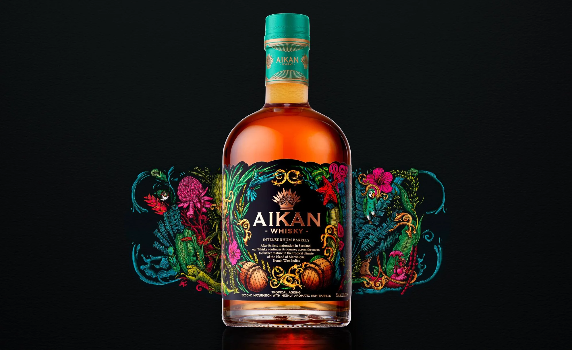
HÉRIOSE – FRENCH WHISKY

Maison Boinaud approached us to create a new look in the spirits market, without breaking with tradition. This century-old cognac house is embarking on a new adventure: the creation of a French whisky distilled in Charentais stills.

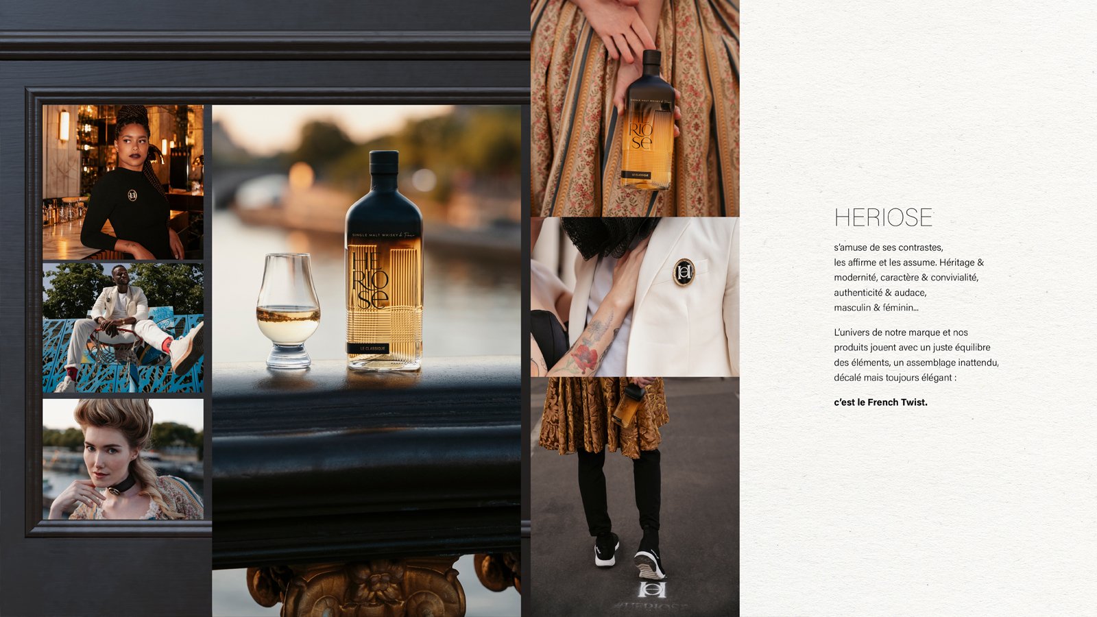
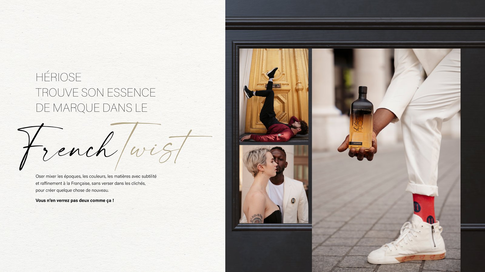
We began by imagining the universe of this young brand. A unique whisky, committed to French craftmanship but breaking the rules, an authentic Single Malt Whisky with a bold and uninhibited spirit. Our concept: the French Twist. Shake up the heritage, mixing it to create an unexpected encounter. The French Twist is always simple yet daring in its associations, styles, shapes, and materials to convey the vision of tomorrow. The brand has fun with its own contrasts, openly embracing them: heritage & modernity, charm & conviviality, authenticity & audacity...

The brand’s universe is a perfect balance of elements: unexpected, offbeat but always elegant.

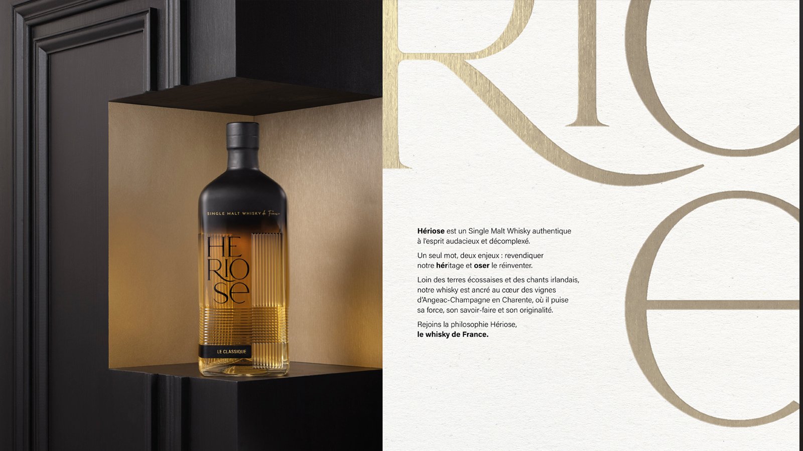
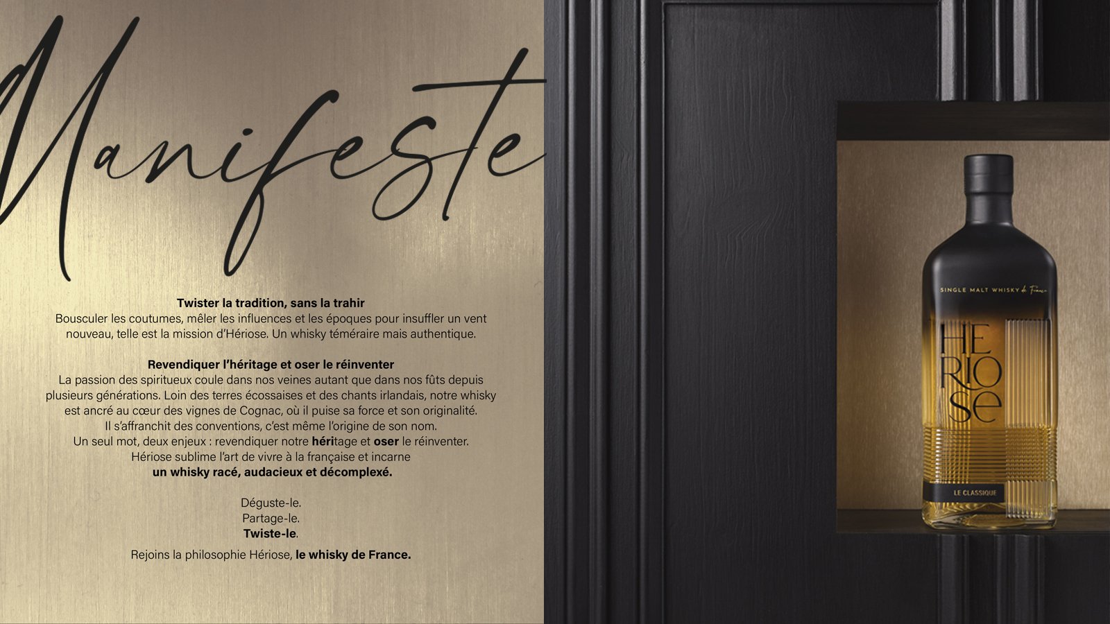
It needed a name and it was up to us to invent it: Hériose was born. One word, two challenges: to claim our heritage and dare (“oser” in French) to reinvent it. Far from Scottish lands and Irish songs, this whisky is anchored in the heart of the Angeac-Champagne vineyards in Charente from where it draws its strength, expertise and originality. 

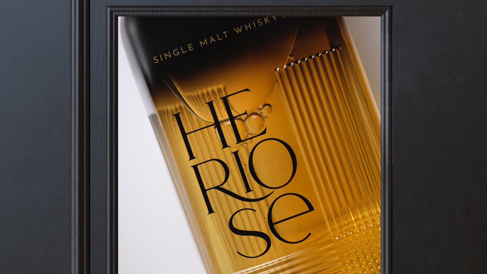
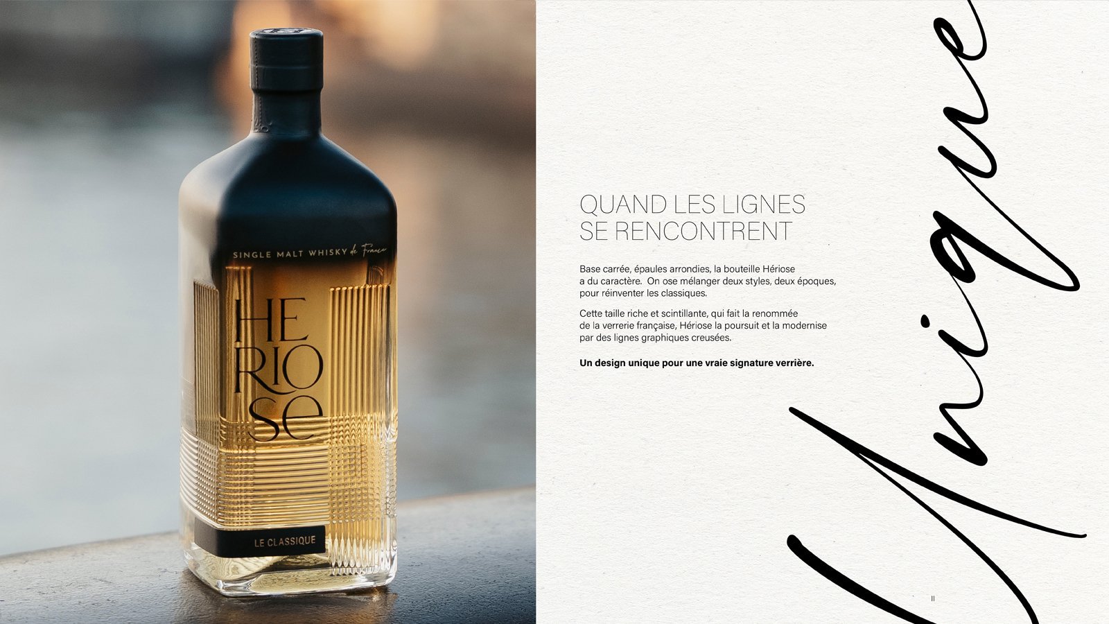
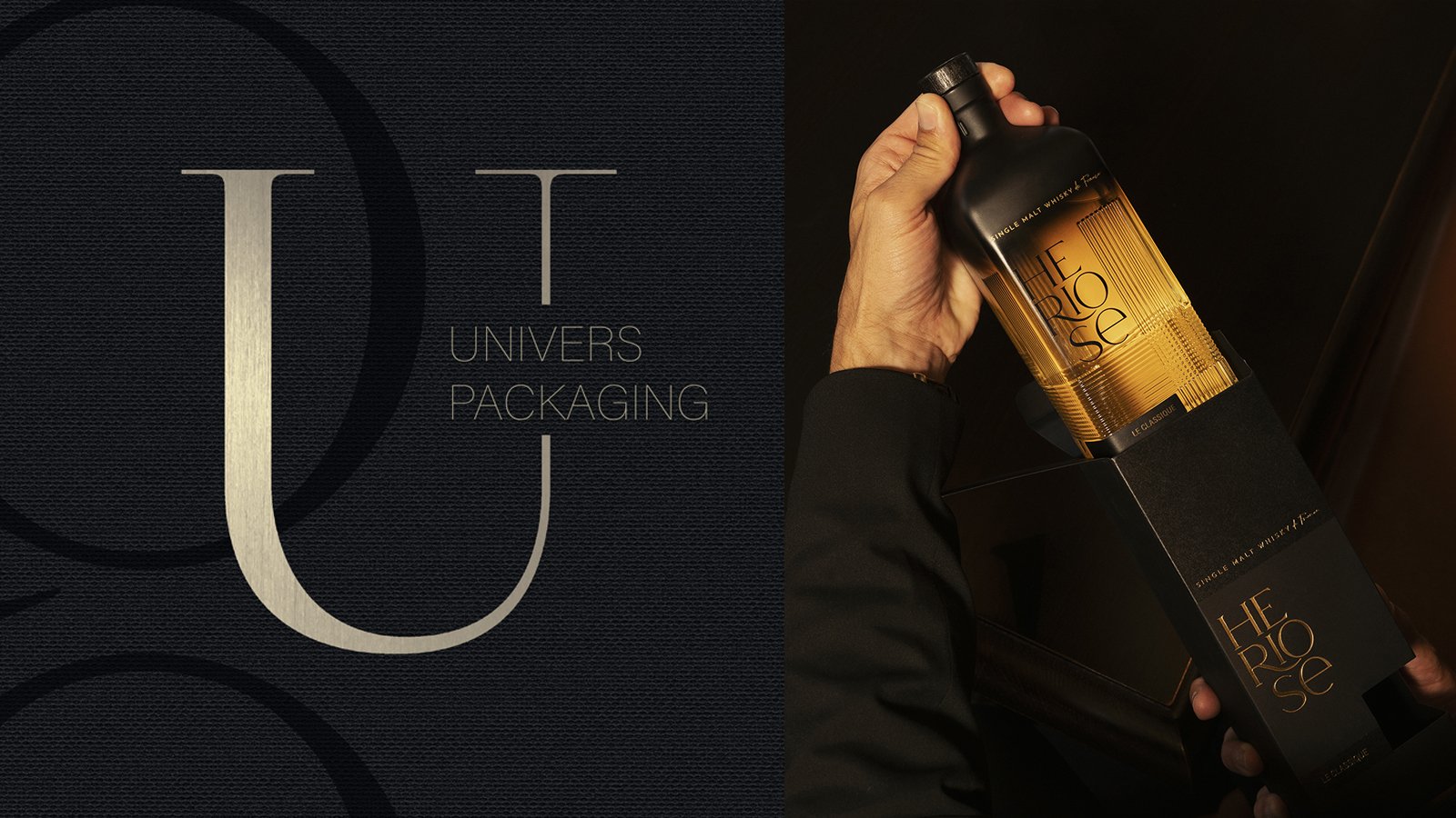
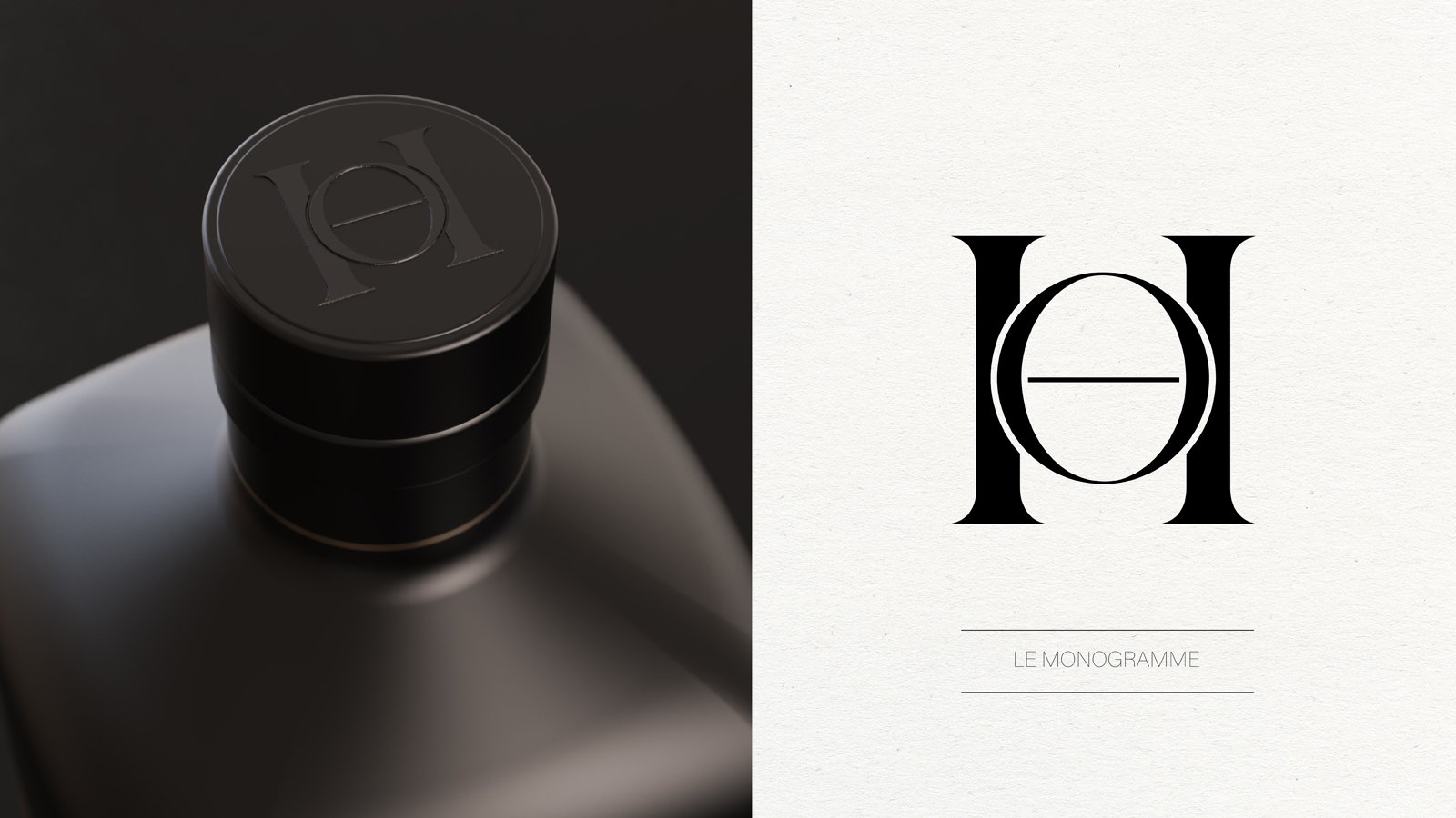
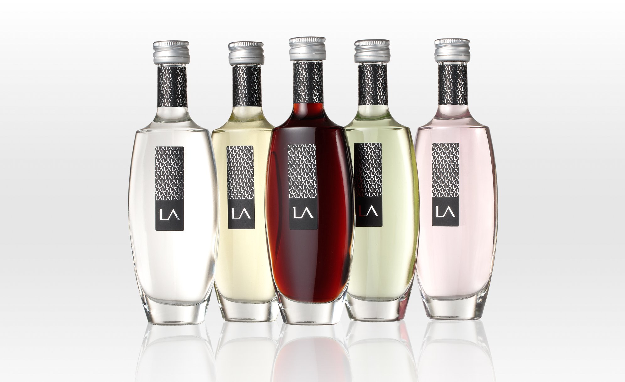
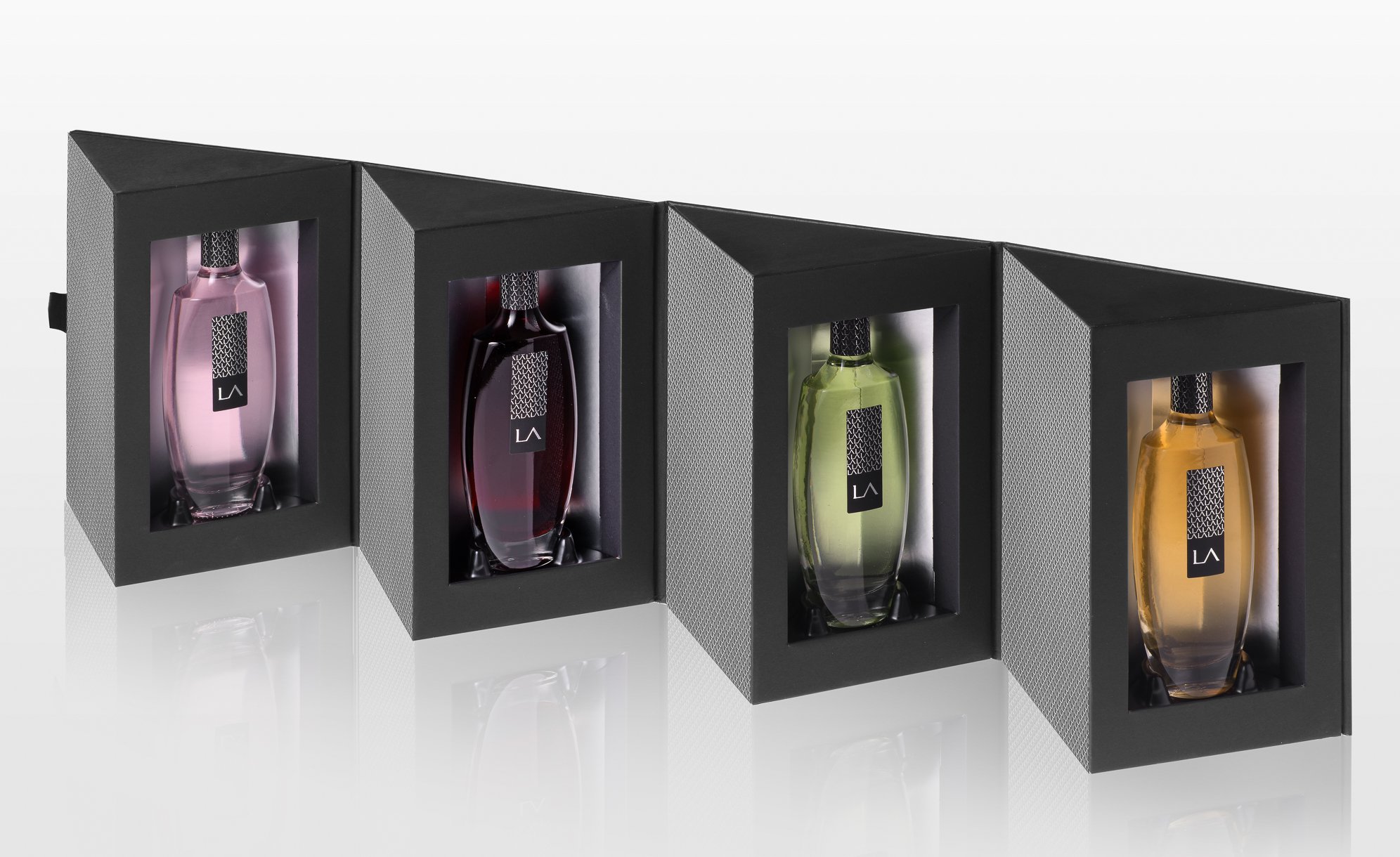
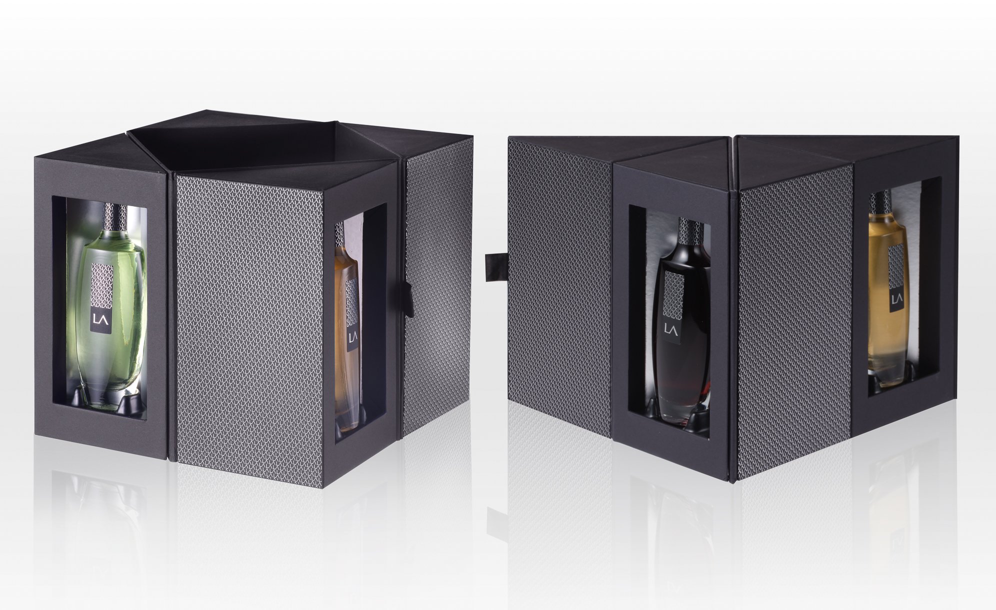
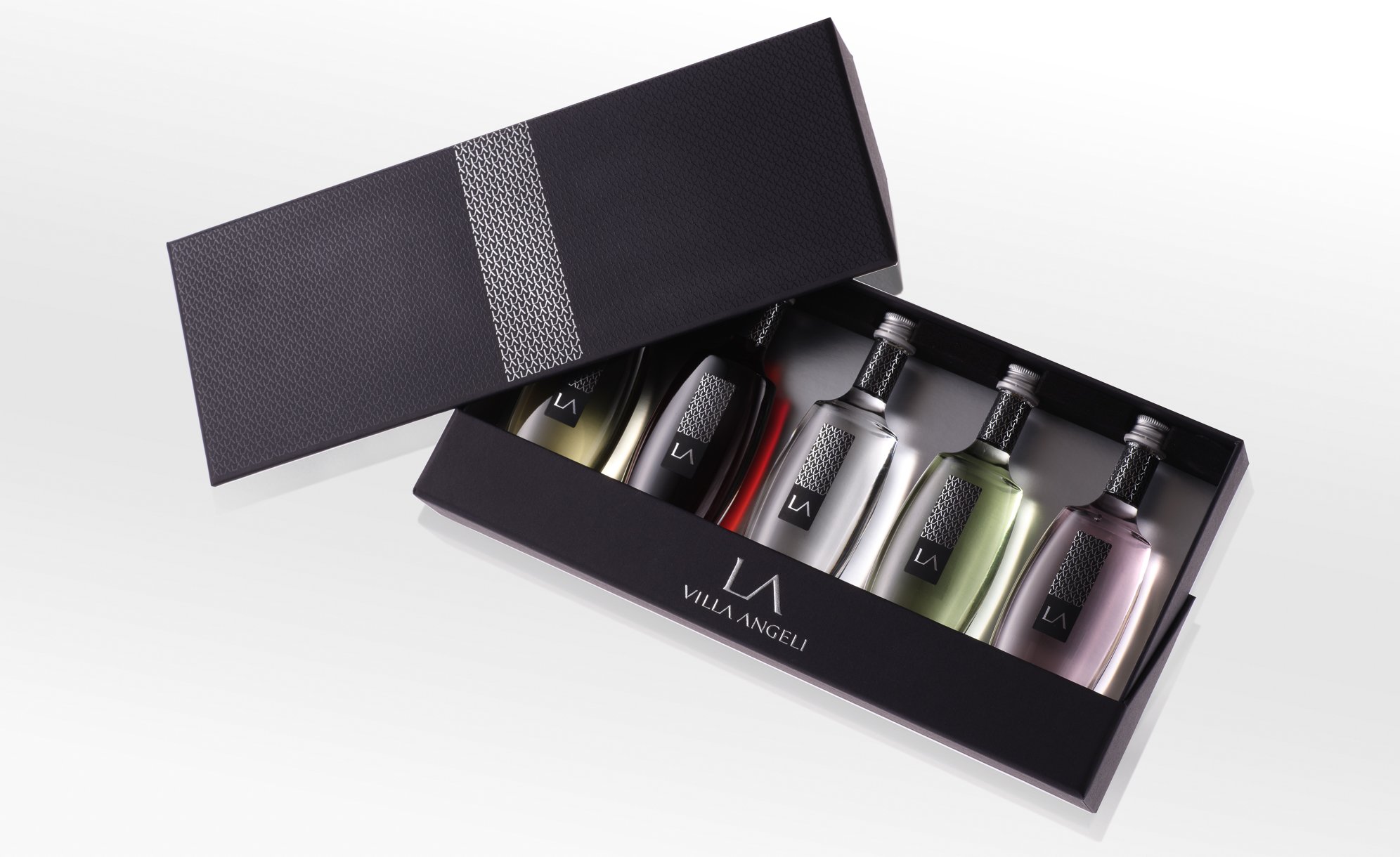
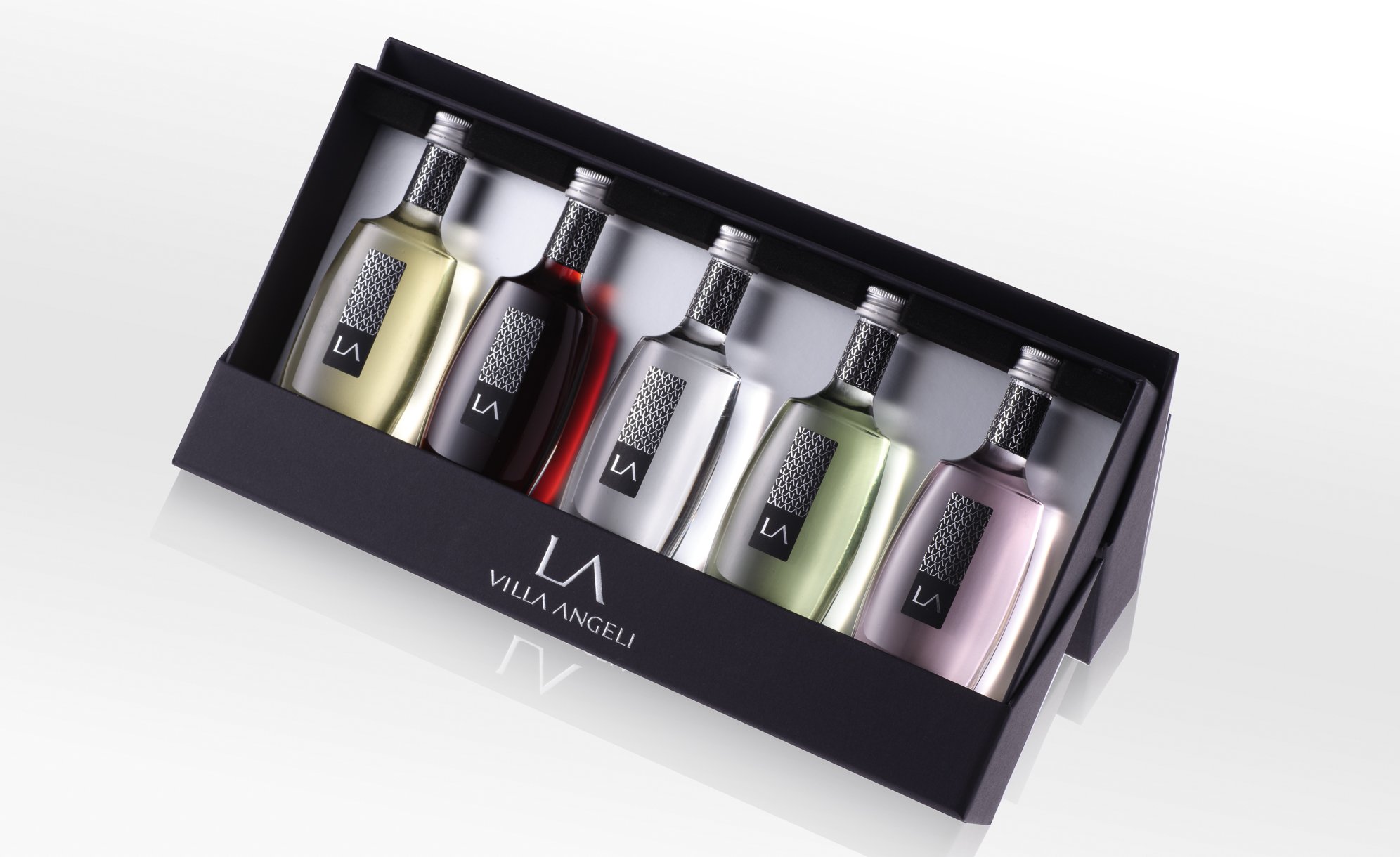
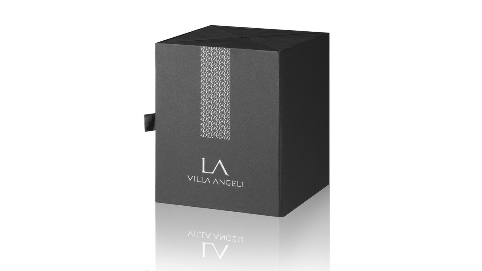
The bottle design is an essential part of the brand’s image and an important distinguishing feature to continue this mix of genres. With a square base and rounded shoulders, the Hériose bottle has character. Daring to mix two styles, two eras, to reinvent French glassmaking classics. This sumptuous and sparkling cut, which made the reputation of French glassmaking, is continued by Hériose and modernised with hollowed-out graphic lines and a matt black surface on the top of the bottle.

A unique twist for a true signature bottle.

The Hériose logo was intended to express its differences loud and clear. Reading over 3 lines, it mixes several typographies and occupies considerable space, while remaining elegant.

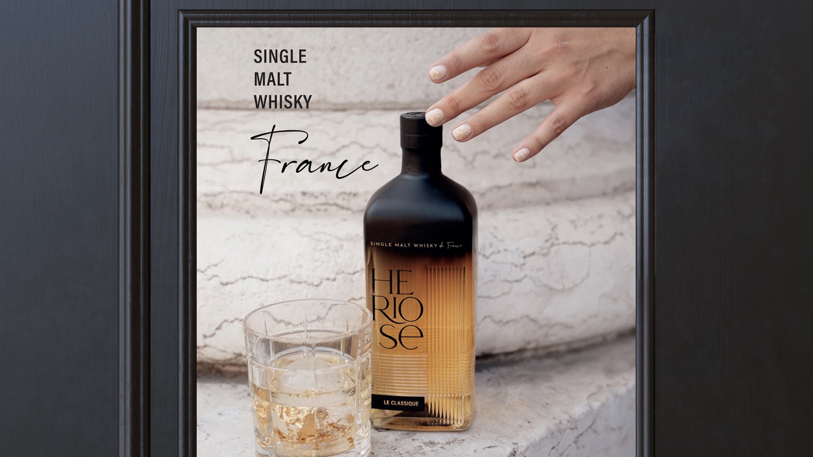
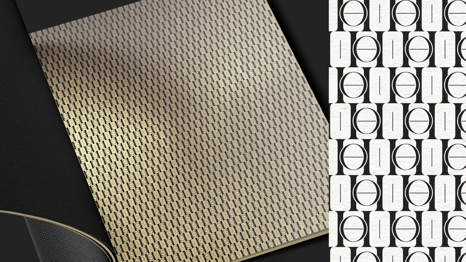
The iconography and brand identity focus on a mix of materials, textures and atmospheres to create the unexpected: Hériose has played the mix & match card.

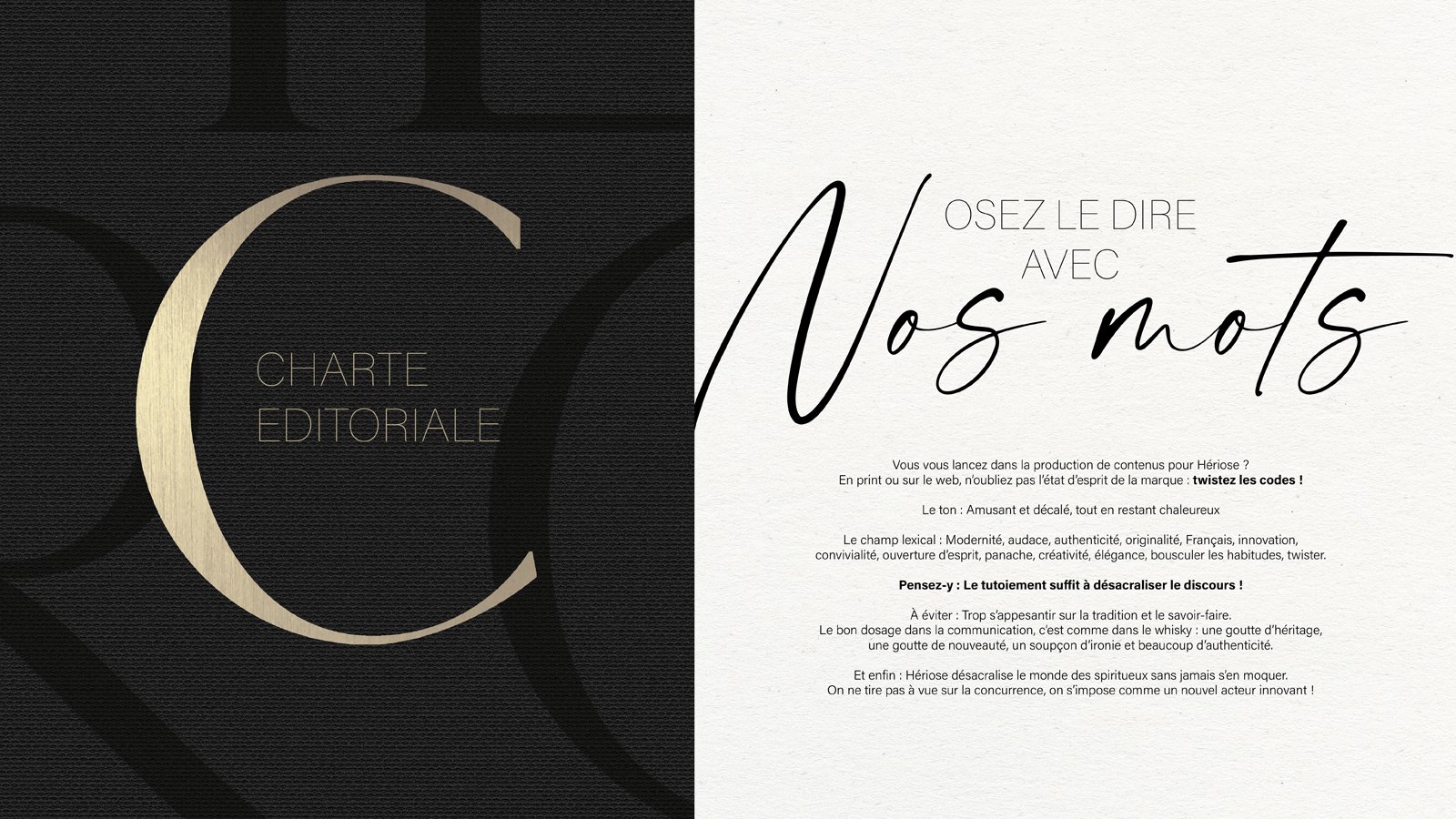
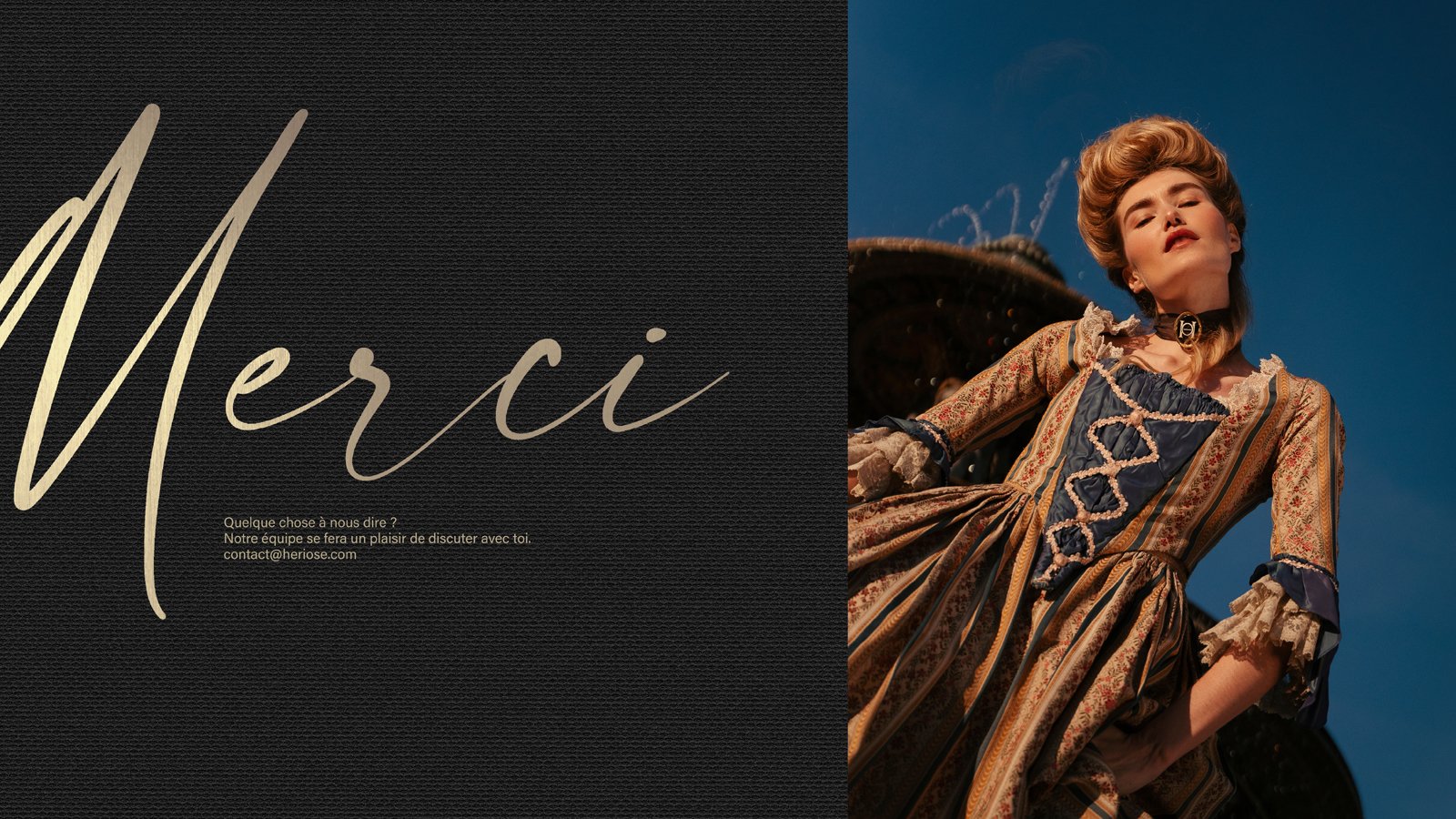
And a brand launch means communication! With Hériose, we created a complete universe of images and text. When writing the brand manifesto, the brand book, the press releases and the press kit brochure, we succeeded in defining a tone that was both offbeat and respectful, experienced and young, open-minded and coherent. The customer is addressed familiarly, invited to come and share a unique experience and to challenge established cues. The layout of all formats expresses as much the product’s distinctiveness as its refinement.

Hériose is a whisky like no other and you can sense this in every way it communicates.

“Enjoy it. Share it. Twist it. Join the Hériose philosophy, the whisky of France.”

Assignments :
Brand concept
Brand strategy
Name
Glass design
Corporate identity
Packaging design
Brand book
Iconography
Design & writing


CAMUS - GLOBAL DESIGN


GLOBAL DESIGN

CAMUS COGNAC DARK & STORMY 

Maison Camus has created Dark & Stormy, a unique cognac born from a historic storm on the Island of Ré.

The island, located not far from the Cognac region, occasionally experiences storms of such magnitude that the ocean water reaches the vineyards. The calcareous and sandy soil is then temporarily saturated with salt and minerals. In 2010, a great storm occurred and Camus used the grapes harvested that year to produce a cognac of exceptional maritime character.

To tell this extraordinary story, we worked with illustrator Yroslav Shkriblyak, who captured the impetuous spirit of the ocean on the label and packaging. This illustration shows each element of the island naturally displayed.

To create the packaging, we imagined the primary and secondary packaging as a second skin, bringing a unique sensory experience to this exceptional cognac.

Assignments :
Corporate identity
Illustration
Primary and secondary packaging design

LENÔTRE - DESIGN PACKAGING


PACKAGING DESIGN

“Patisserie, you know, isn’t made to feed people, but to give them something sweet to share.” Gaston Lenôtre

In 2019, Maison Lenôtre redesigned its brand platform and identity to establish its new signature “Maison Parisienne de la Gourmandise” and to bring a breath of fresh air to this firmly established player in the world of French gastronomy.

Maison Lenôtre asked us to completely redesign its packaging range, with the aim of restating Lenôtre’s traditional expertise and embodying the new brand platform. To creatively use the different resources and design potential to meet the specific objectives of each product line (accessibility/celebration). 

The agency suggested translating this new identity across the range to give the new packaging a real personality and a unique character while staying on-brand. The packaging was designed with an eye for detail in terms of the choice of materials and subtle finishing touches. The packaging design reinforces and enhances the brand’s new visual identity in keeping with its gourmet creations.

Developed packaging

Confectionery bags : a simple folding technique that reflects the artisanal side of the brand while also being modern. The ears of wheat on the side of the packaging are part of the design while at the same time being part of the folding. This clever bag has two possible sizes due to the way it is folded.

Macarons range : the macaron is the icon of Maison Lenôtre, its trademark and its source of pride. Redesign of all formats to showcase the product and its many flavours.

Chocolate bar packaging
Bags, patisserie packets 
Biscuit gift box
Jam rang   
Product personalisation rings

Assignments :
Packaging Design

AIKAN WHISKY INTENSE


PACKAGING DESIGN

Aikan, a favourite among lovers of rum as well as whisky for their whiskies distilled in Scotland then aged in Martinique.

We are delighted to unveil the fourth product in the range: Intense Rhum Barrels, a distinctive whisky with especially prominent notes of tropical fruits and French pastries.

Assignements :
Brand identity
Packaging design
Illustration colouring

COMTESSE DU BARRY – CHRISTMAS 2021


PACKAGING DESIGN

A culinary journey inspired by a Christmas classic!

As every year, the
Comtesse du Barry brand entrusted us with the full design of its Christmas range.

For 2021, we opted for a collection inspired by the famous classical ballet,
The Nutcracker. 

The story of “The Nutcracker and the Mouse King” and Tchaikovsky’s ballet melts away
the barriers between childhood, dreams and reality. The success of the story has made. The Nutcracker a Christmas icon.

The boxes with their decoration inspired by the imagination and the magic of Christmas hold a selection of refined and exquisite products that the brand has earned its reputation for.

A brightly coloured collection in which each box is different and helps to recreate the story of The Nutcracker, with characters from the ballet or individual details of their beautiful costumes.

Get into The Nutcracker spirit with our 2021 boxes.

Assignements :
Packaging design
Graphic design

LA VILLA ANGELI – CORSICAN LIQUEUR


PACKAGING DESIGN

This estate established on Antiparti soil was founded by Albert Mizael in the 1960s. His children including Guy Mizael took the reins in 2000. Together they have completely restructured the vineyard and brought fresh momentum and ambition to this family-run estate.

The agency was hired to design the visual identity of La Villa Angeli wines used in 5 liqueurs in miniature format as well as 3 boxes offering a range of presentation techniques to showcase the style of these iconic liqueurs with packaging to match.

A way to promote Corsican liqueurs in an original and premium way, far removed from the old clichés.

Three-liqueur gift box (Clementine, Myrtle, Lemon). A fun and practical gift box that tourists can easily take back home with them for a souvenir of the “isle of beauty”.

Four-liqueur gift box (Clementine, Myrtle, Lemon and Citron)  Designed with merchants in mind, this premium gift box can be presented in a number of ways depending on how it is folded. Unfolded to its fullest extent, all four liqueurs are on proud display. In its multiple configurations, the box can also be presented in rectangular, triangular or rhombus form.

Five-liqueur gift box (Clementine, Myrtle, Lemon, Citron and Eau de vie) With B2B in mind, the agency gave this box a dual purpose. Thanks to the lid design, the box can be turned into a display to perfectly showcase all five bottles.

Assignements :
Adapt the existing brand identity to the miniature format
Packaging design

CONQUÉRANT SPIRITS


GLOBAL DESIGN

Amidst the lands formerly occupied by the famous William the Conqueror, Duke of Normandy, King of England, two childhood friends have decided to launch their spirits brand. They came to the agency to help them create a complete brand image. 

 In the Swiss Normande and in Calvados, the two friends produce unique Organic gins. In their respective priory and Abbey gardens, they grow the ingredients they need for their production.

Passionate about the history, environment and beauty of the different landscapes in this region, the two partners wanted to find the expression of these noble places and their unique flavours. 

It’s called Conquérant Spirits and bears the brand image and its graphic design with flair. A design reflecting the strength and character of the glorious historical figure that it celebrates. 

Assignements :
Brand strategy
Naming
Brand identity
Packaging design